Analyzing the Art
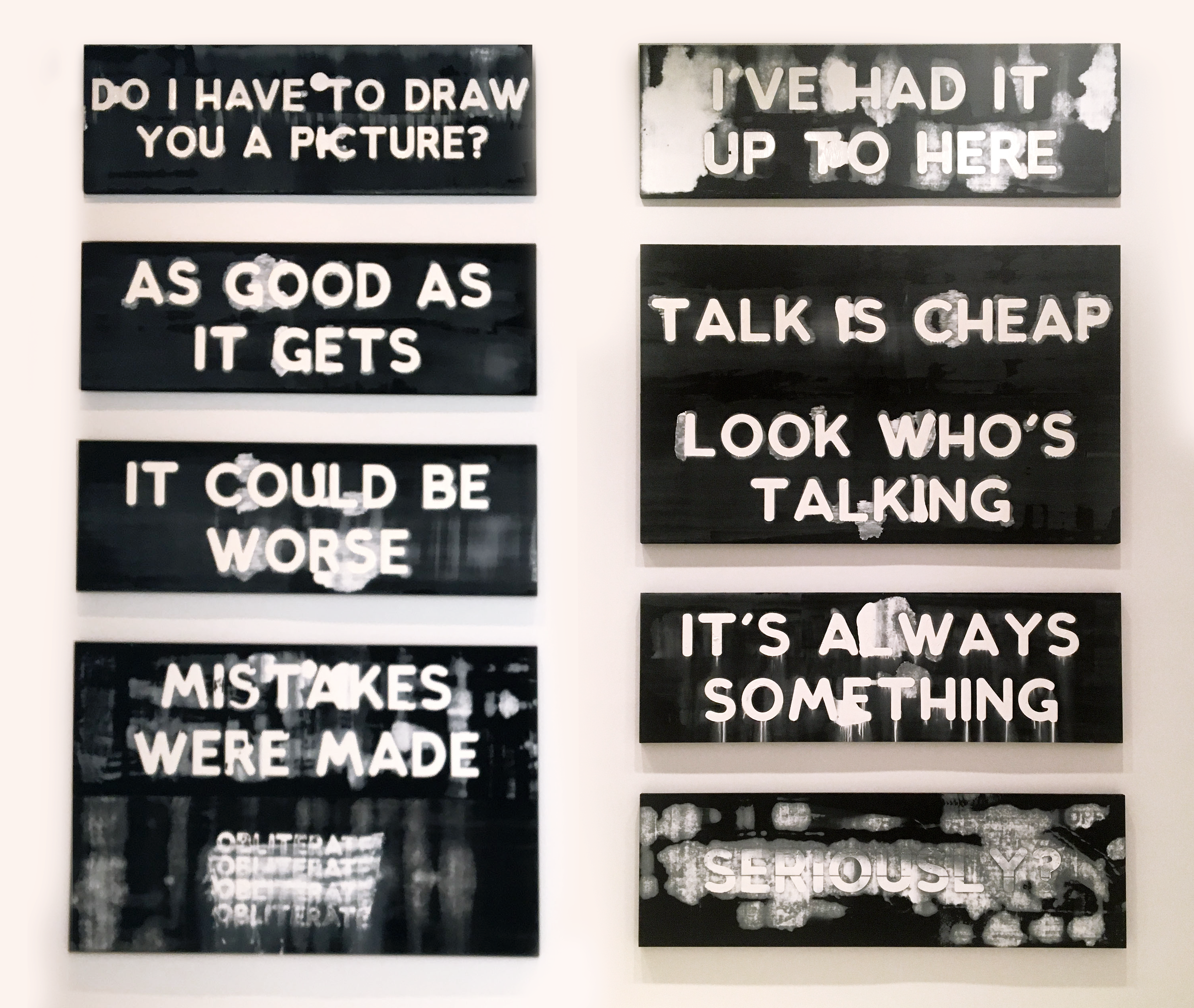
Mel Bochner's work focuses on emotions and linguistics; with my redesigned exhibit, I wanted to enhance the emotions that Bochner intended to evoke from the viewers. I focused on two main feelings: frustrations and anxiety.
Bochner also uses a colossal amount of paint on his canvases, which I higlighted through digital user interaction.
From my design, I targeted the experience to revolve around the emotion from the Bochner’s work, as he often plays with the relationship between language, art, and emotion.
I decided to use the actual physical space to highlight these feelings. By designing the physical walls to interact with the visitors, I hoped to create an experience.
Exhibition Space
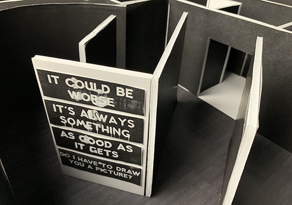
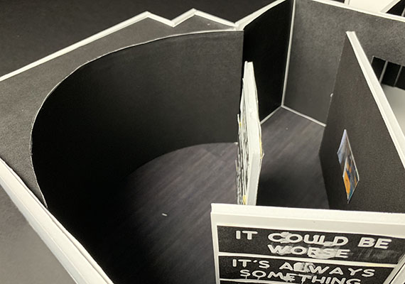
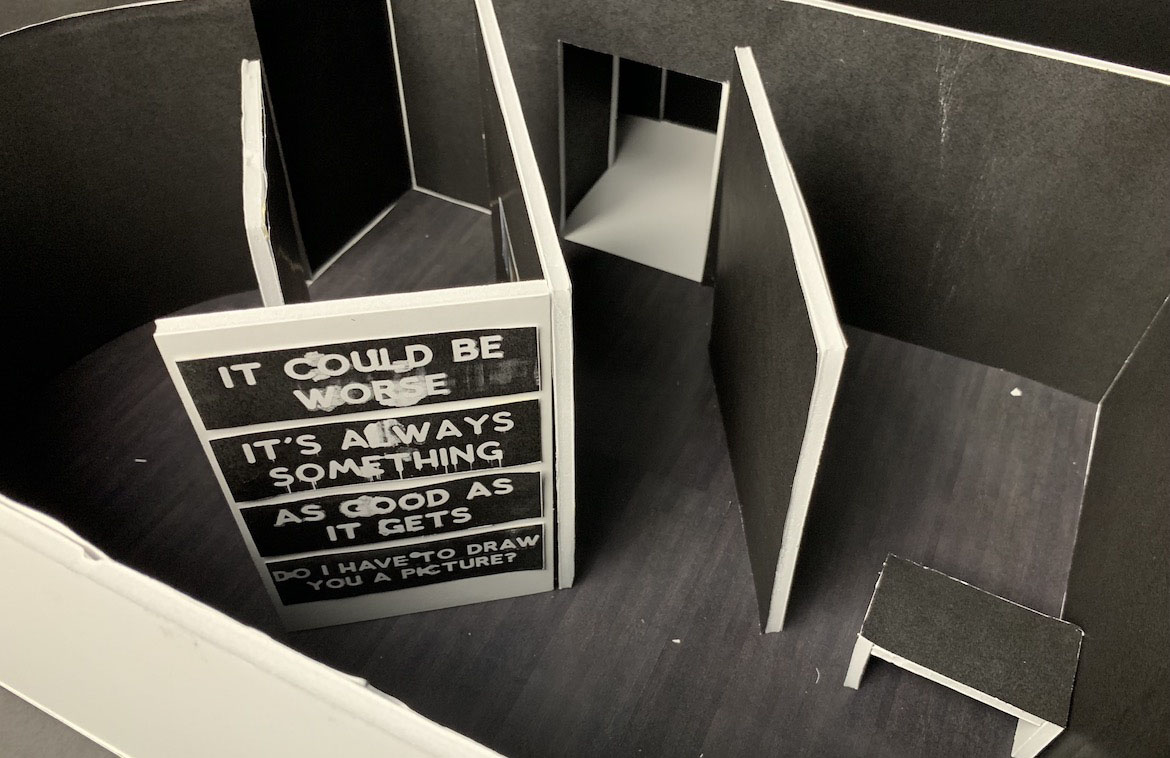
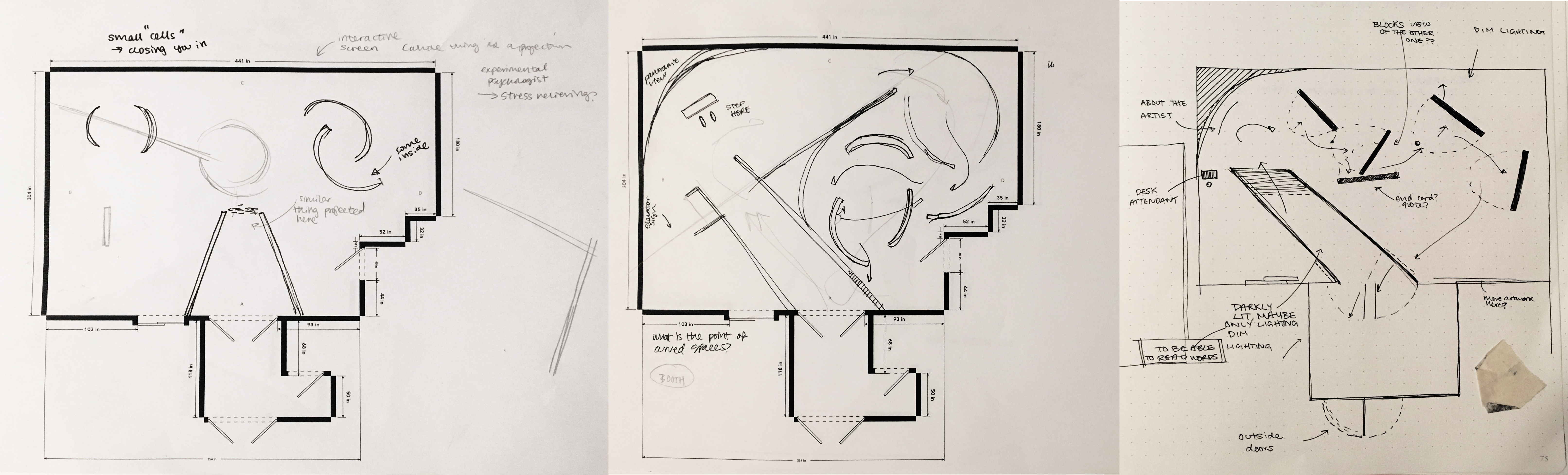
As the user walks in, they are met with two large walls that are relatively closed in. I was careful to measure this out, because I wanted the users to feel anxious, but not too claustrophobic. In this space, there is barely any light; the only lights that visitors can see are to the end of the hallway, which are soft and used in order to illuminate the artist statement at the end of the hall. To either sides of the main hallway, there are emergency exits for visitors to use, but are intended to not be noticed by visitors when they first come in due to the darkness of the hallway and the only light being at the end.
After hashing out my general idea, I began to plan the actual floor plan of my exhibit. Using the room's floor plan that I created, I began to sketch different possible walls to put the paintings on and routes that visitors could take.
As the user walks in, they are met with two large walls that are relatively closed in. I was careful to measure this out, because I wanted the users to feel anxious, but not too claustrophobic. In this space, there is barely any light; the only lights that visitors can see are to the end of the hallway, which are soft and used in order to illuminate the artist statement at the end of the hall. To either sides of the main hallway, there are emergency exits for visitors to use, but are intended to not be noticed by visitors when they first come in due to the darkness of the hallway and the only light being at the end.
Because of the two shortcut exists in the dark hallway users first walk through, I needed some sort of “light” goal for user’s attention to be drawn to so they don’t see the shortcuts. I decided this to be a short “about the artist” at the end of the hallway that would be the only brightly lit piece in the area.
As for the desk attendant, I kept them tucked away from the rest of the exhibit because I purposefully did not want to give my users too much information as they go through my exhibit. I want them to be quite literally kept in the dark, until they move to the last segment of the exhibit (with the video). The desk attendant is kept near the elevator and would mostly serve as a guide in case people need help moving through the exhibit and using the elevator, but will not be a crucial moving piece in my exhibit.
Digital Interaction
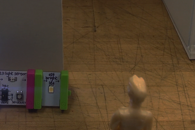
My overarching goal was to have the user express a similar emotion as the artwork, thinking that this would elevate the overall experience and truly evoke emotion within the exhibit. I first wanted motion sensitive technology: by having the user express frustration, anger, etc (stomping, crossing arms, or simply frowning), the screen would change and depict artwork matching their emotion.
I later determined that I did not necessarily need my users to feel the same emotion; they only needed to understand and emphasize with the emotion rather than feel frustration or exasperation themselves (as this would be difficult to evoke, especially within an exhibit, with no actual emotional catalyst).
Therefore, I utilized light sensitive technology to create an interaction that would let the painting light up (from the darkness of the exhibit) when the user comes closer.
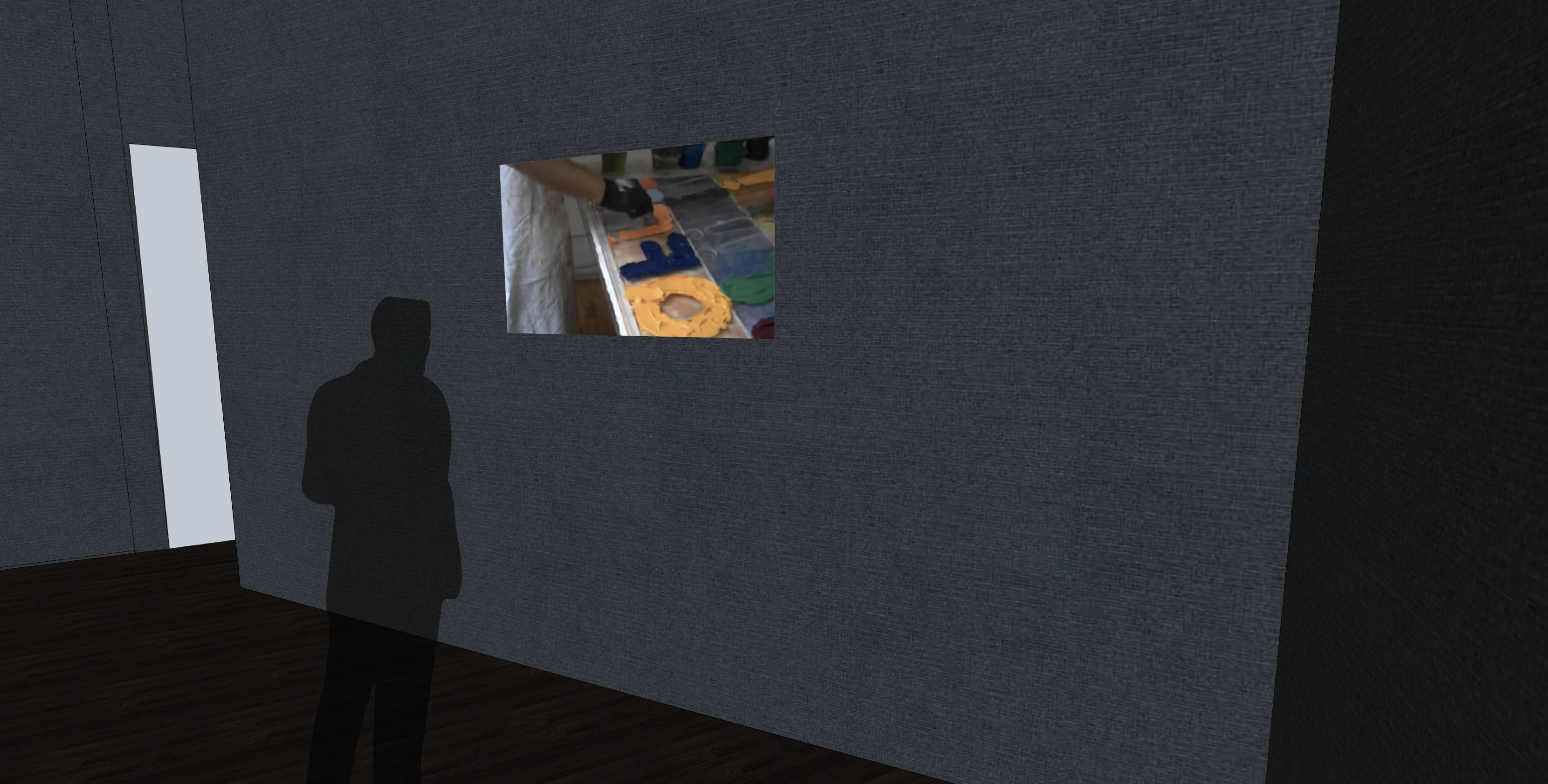
Despite the dramatic and intense format of my exhibit, I still want my users to leave with a good experience — I want to give them some sort of closure after experiencing and viewing Bochner’s work.
In the last segment, I designed a small nook for the users to walk through that played a video (30 seconds, played on a loop with no words) that showed Bochner’s creative process of creating his works. The users knew of Bochner’s works and his intentions, now I wanted them to learn about how he actually made paintings.